
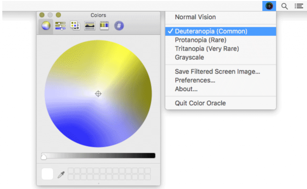
Bernie Jenny from Monash University in Australia has developed Color Oracle as a free colour deficiency simulator for Windows, Mac and Linux. When designing any software, apps or websites it allows you to check the colour choices.
This download works on older operating systems as well as the latest ones using Java, but it is important to follow the developer’s instructions for each operating system. It is very easy to use on a Windows machine where the app sits in the system tray and can be used at any time when testing colour options by selecting an area on the screen.
Another trick when designing web pages or other documents is to view them in grey scale or print them out to test readability.
This strategy comes thanks to Andy Eachus at University of Huddersfield.